
Artwork Guidelines
Our cutting-edge DTF technology ensures vibrant, durable, and detailed prints—but to get the best results, your artwork needs to be print-ready.
File Requirements
Follow these four essentials to ensure your artwork prints perfectly every time.
Submit Files in PNG Format
with a transparent background (preferred)
300 DPI Recommended (72 DPI Minimum)
for sharp, high-quality prints
Use sRGB Colour Profile
for the most accurate colour translation
How You See It In The Online Mockup
is an accurate representation of how it will print
Design Elements to Avoid
Some effects look great on screen but don't translate well to DTF printing. Avoid these for the sharpest results.
Semi-Transparent Elements & Soft Glows
These don't print well and may look faded.
Drop Shadows & Low-Opacity Effects
Can cause uneven printing.
Thin Lines & Small Details
Keep all text & lines at 2mm minimum for clarity.
Fine Dots or Isolated Details
Small dots may not transfer correctly.
Stick to bold, high-contrast designs for the sharpest results!
File Types To Avoid
Avoid these file types — our system won't process them correctly.
Need help with file setup?
Check out our Design Help pageHow to Colour Match Using Our Swatches
Use this guide to match on-screen colours to how they'll actually print.
The top row shows the colours as they print on a black AS Colour tee using our DTF process.
The bottom row is the original digital artwork file used for printing.
To achieve the closest match in your own design, reference the printed swatch and find the corresponding colour code from the digital row beneath it.
Then, use that digital colour code in your design to ensure it prints as expected.
DTF prints look different on screen vs fabric. Always match using the printed result, not what looks best on screen.
Colour Accuracy & Printing Disclaimer
The colours you see on-screen won't always match what you see on fabric — here's why:
Digital Image vs. Real-Life Print
The same artwork, on the same garment — as supplied, and as printed.
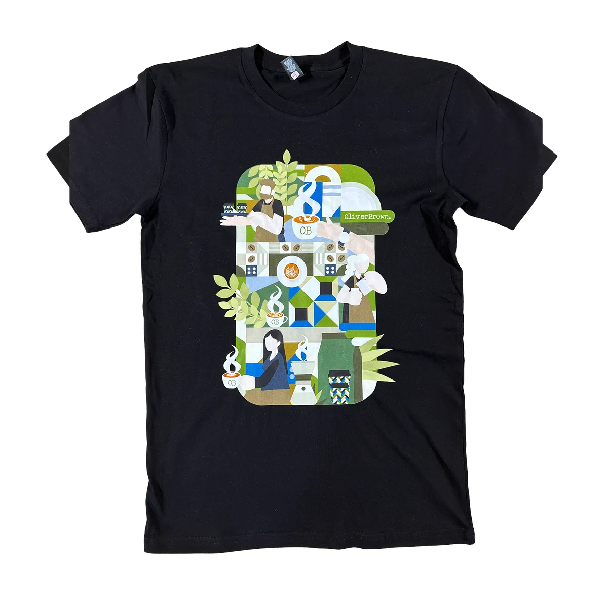
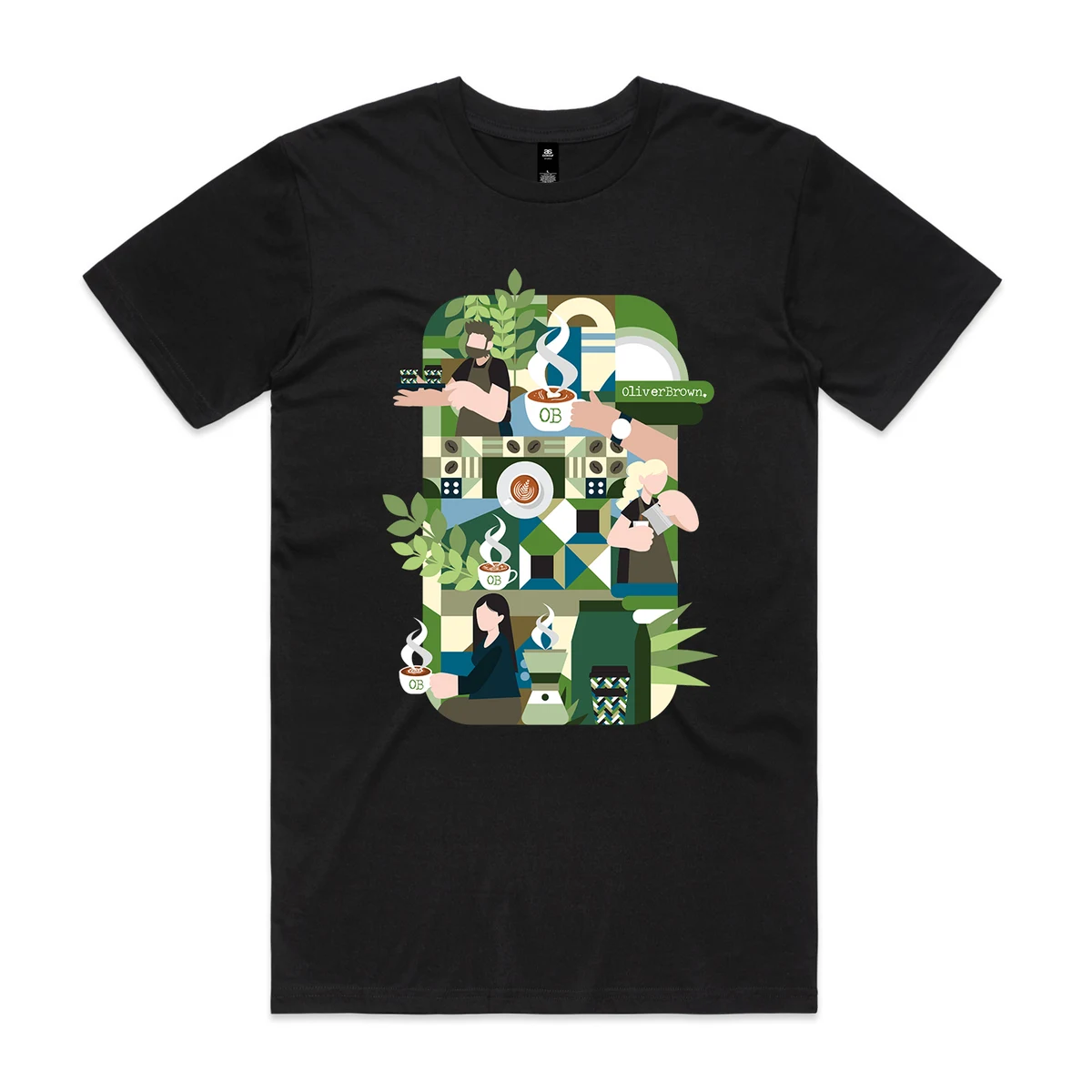
Drag to compare. The printed result is softer and slightly warmer than the file — normal for ink on fabric.
RGB vs CMYK
Your design is created in RGB, but our printers convert it to CMYK, which has a different colour range.
Neons & Metallics
DTF cannot reproduce true neon, metallic, or ultra-bright colours.
Garment Material Matters
A colour will print slightly differently on 100% cotton vs polyester due to fabric absorption.
White Ink on Dark Garments
White ink on red, maroon, and other bright fabrics may appear slightly tinted.
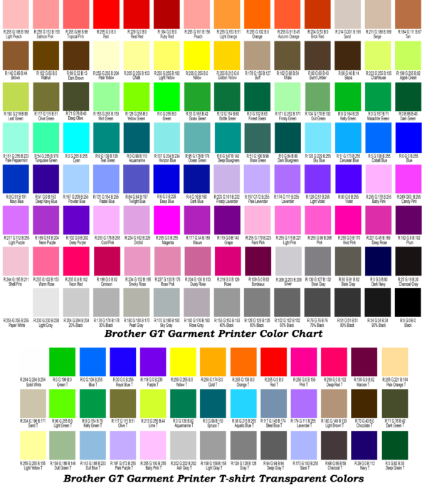
Want the best colour accuracy? Pick your RGB values from the charts below. Each pair shows the values as they look on screen, next to a photograph of those same values printed on a black tee.
On screen (RGB)
The values you pick in your design file.
Printed on a black tee
The same values, photographed after printing.
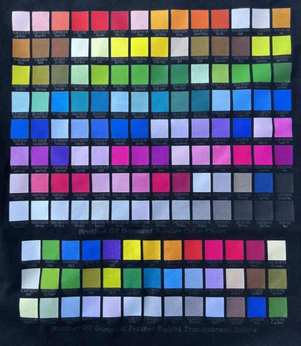
Tap either chart to open it full size. Printed results vary with garment colour and fabric.
Ready to Print Your Design?
Browse our full range of premium AS Colour garments and start your custom apparel order today.